
Introduction: Designing Product Cards That Drive Action
I led the visual redesign of edX’s product cards on the homepage and search results, a key UX touchpoint for millions of users. My goal was to make course selection faster and more intuitive by improving visual hierarchy, layout clarity, and how essential course details were presented.
Role: Design lead
Timeline: 1 month
Company: edX
Focus: Visual clarity, responsive layout, scalable design system
The Challenge: Attractive Cards, Unusable Content
User research revealed a major usability issue: while our product cards looked clean, they lacked critical decision-making details such as course cost, length, level, and user ratings. This forced users to click into multiple course pages just to compare options.
From a visual design standpoint, I was looking at a UI that prioritized branding over function. My task was to reverse that: elevate clarity without losing aesthetic consistency.
Visual Audit: Key Gaps in the Existing Cards
I began with a visual audit, mapping out missing elements and analyzing their impact on decision-making. The cards overemphasized partner logos and imagery, but buried or completely omitted information like duration or difficulty level. Even when present, content wasn’t visually structured for scannability.
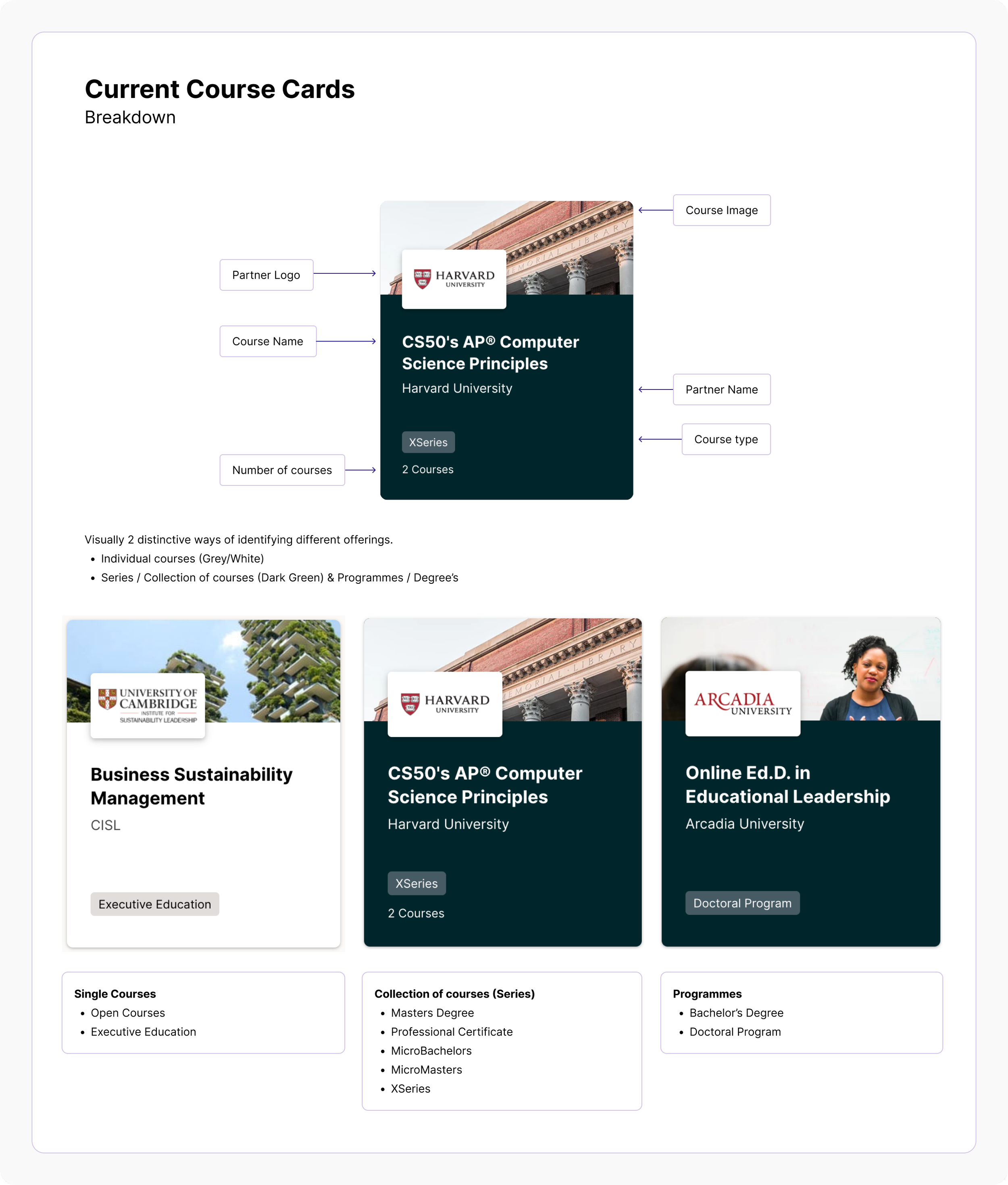
Competitive Analysis: What Other Platforms Got Right
Next, I examined course cards on Coursera, Udemy, and LinkedIn Learning. These platforms surfaced essential details right on the card, using visual cues like iconography, dividers, and consistent content zones to help users quickly assess options.
This competitive review shaped my visual direction: create a denser, more informative card without making it feel overwhelming.


Content Prioritization: What to Show, What to Save
Through collaboration with Product and Marketing stakeholders, we aligned on key content:
Include: course level, duration, course type
Defer: course cost (pending additional pricing research)
This allowed me to focus my visual explorations around a fixed set of content modules.
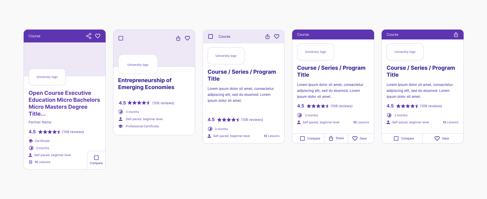
Visual Exploration: Iterating on Structure and Style
I explored multiple card layouts in low fidelity — with and without images, stacked vs. inline content, and different information groupings.
Stakeholders initially leaned toward cards without images for consistency, but I used our research to advocate for visuals. Users found that imagery helped them distinguish between offerings faster. By showing side-by-side comparisons and testing image treatments, I gained stakeholder buy-in.
My visual design decisions focused on:
Creating clear zones for scanning (top: imagery, middle: details, bottom: CTA)
Using consistent iconography for duration, level, and course type
Applying visual rhythm through spacing and alignment
Introducing subtle backgrounds and dividers to separate metadata
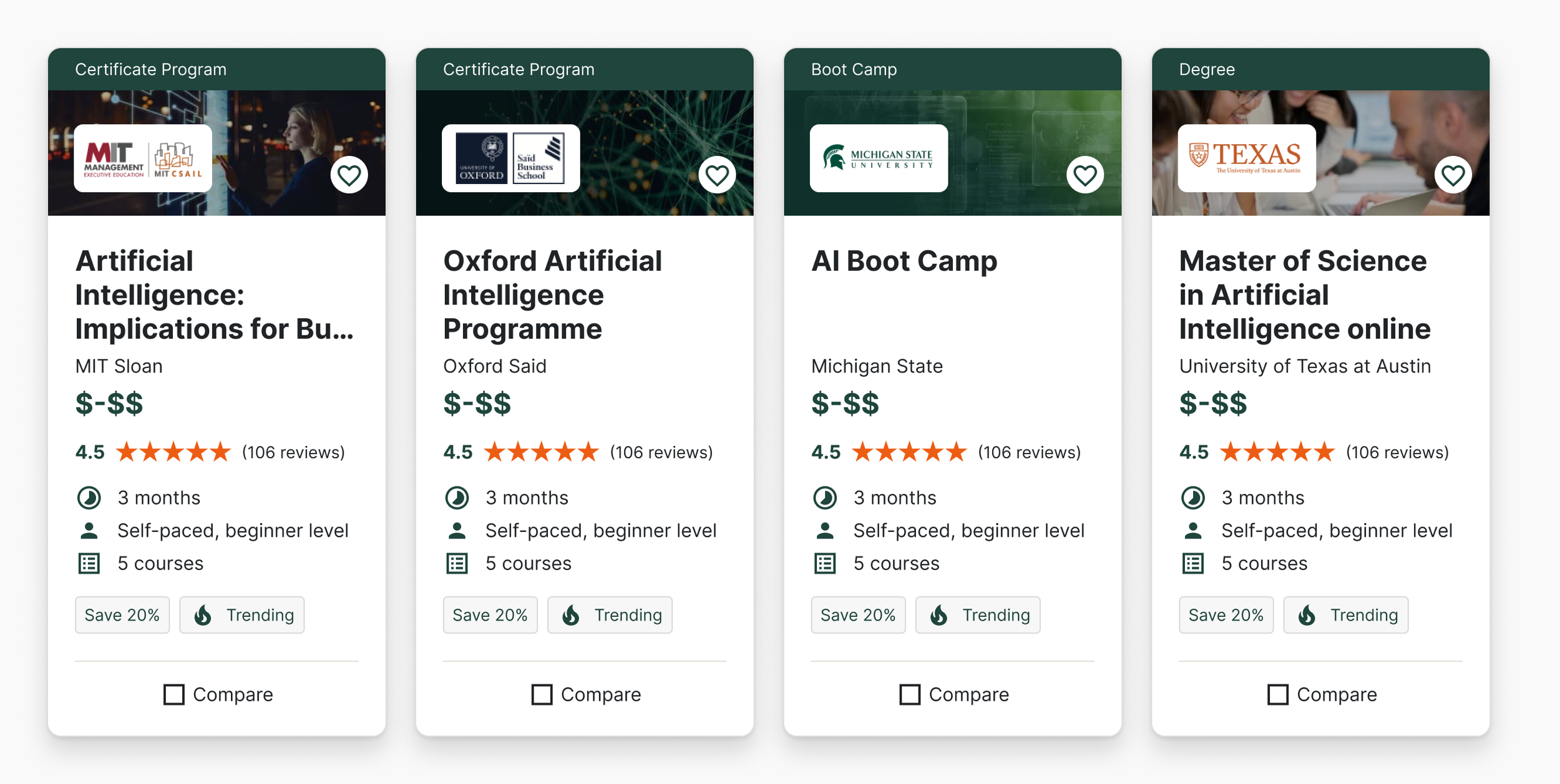
Final Design: A Clearer, Smarter Course Card
The new design brought structure and clarity to the card experience:
Key details surfaced without clutter
Images remained consistent and responsive across breakpoints
Information aligned to a modular system for flexibility across pages
To showcase the impact of these visual design changes, I created a side-by-side comparison of the original and redesigned course cards:
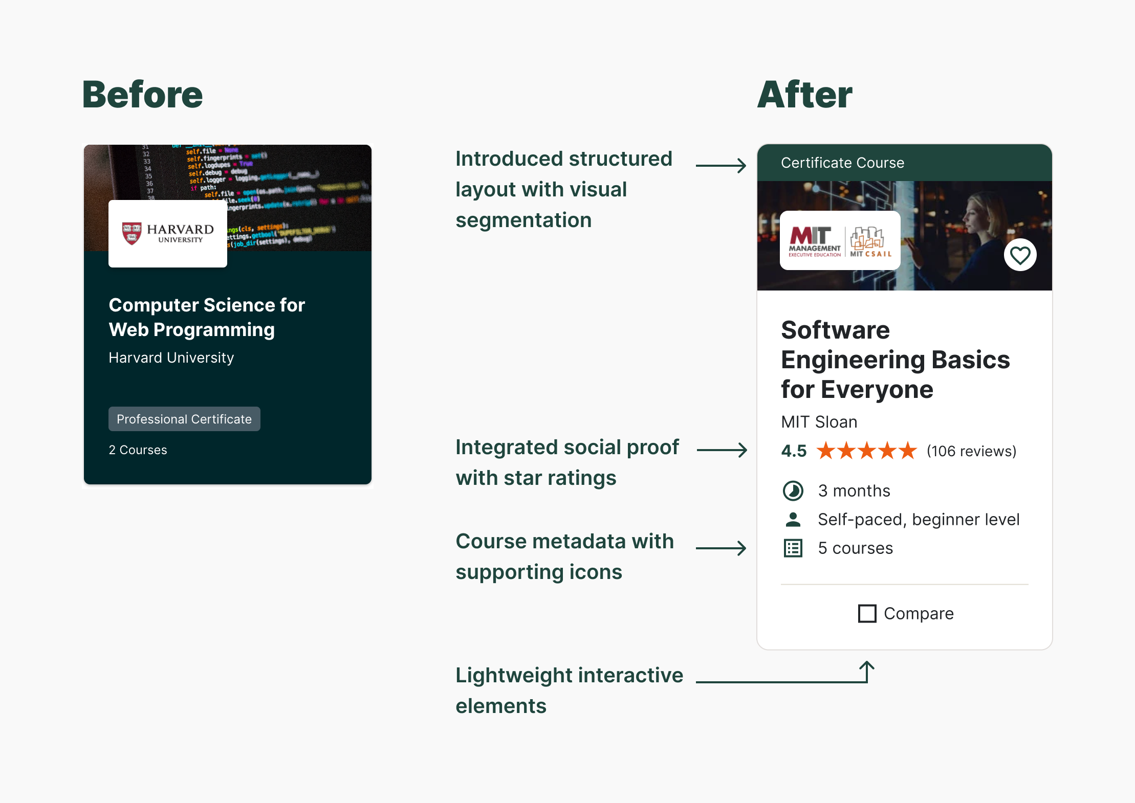
Visual Improvements: Before vs. After
The original card design emphasized branding but lacked structure, hierarchy, and decision-making cues. The redesigned version introduced a clearer, more scannable layout with improved visual hierarchy and accessibility.
Key improvements included:
Layout & Structure: The card was divided into clear content zones — image, title, metadata — with consistent padding and vertical alignment that enhanced scannability across both desktop and mobile.
Typography: A refined type scale helped prioritize content, with increased legibility for course titles and a clear distinction between primary and secondary text.
Iconography & Metadata: I introduced icon-based indicators for course length, format, and quantity to support quick scanning and reduce cognitive load.
Color & Contrast: Moving away from a dense background, I adopted a white card base with subtle dividers and accent colors to draw attention to key information like ratings and course type.
Interactivity: I added lightweight interactive elements — a favorite icon and compare checkbox — with clear affordances that maintained the card’s clean visual rhythm.
These changes made the cards feel more modern, more useful, and more aligned with how users browse and evaluate courses.
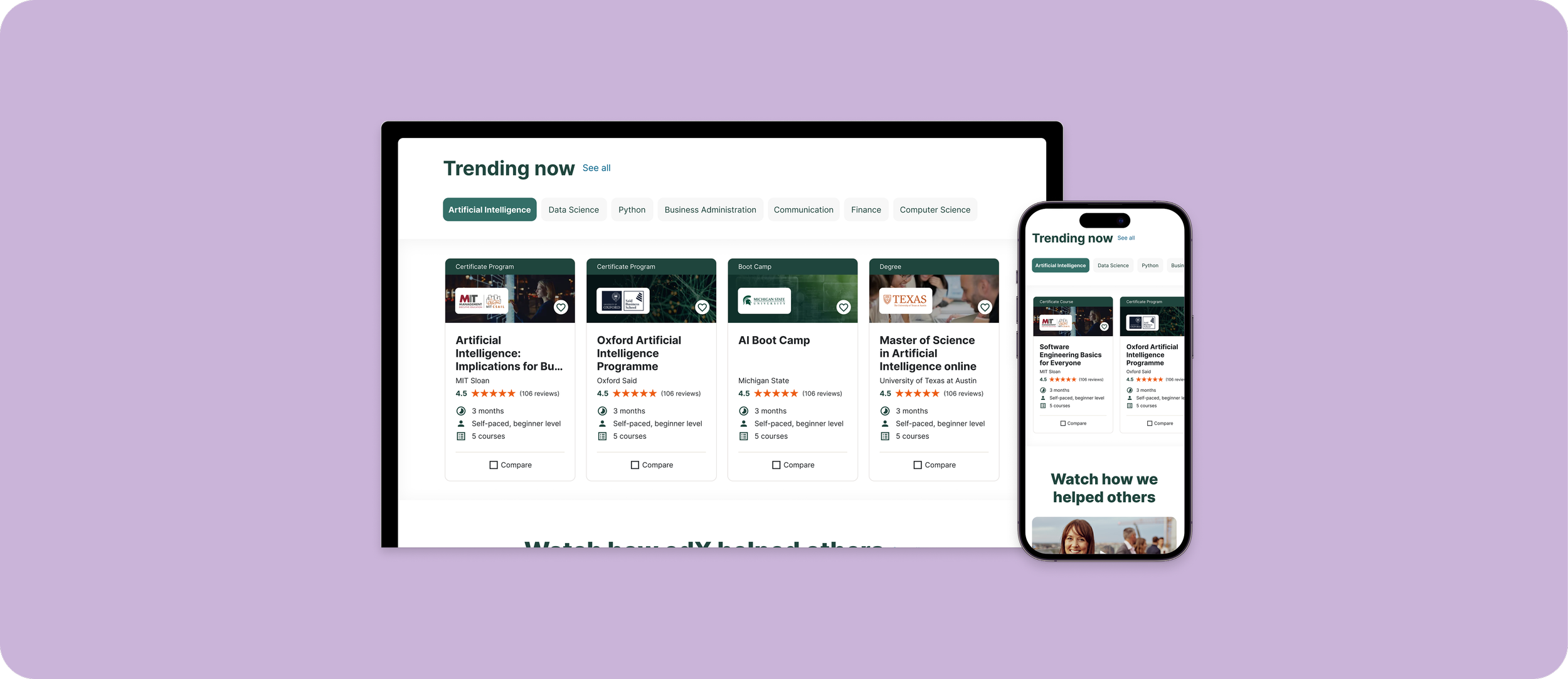
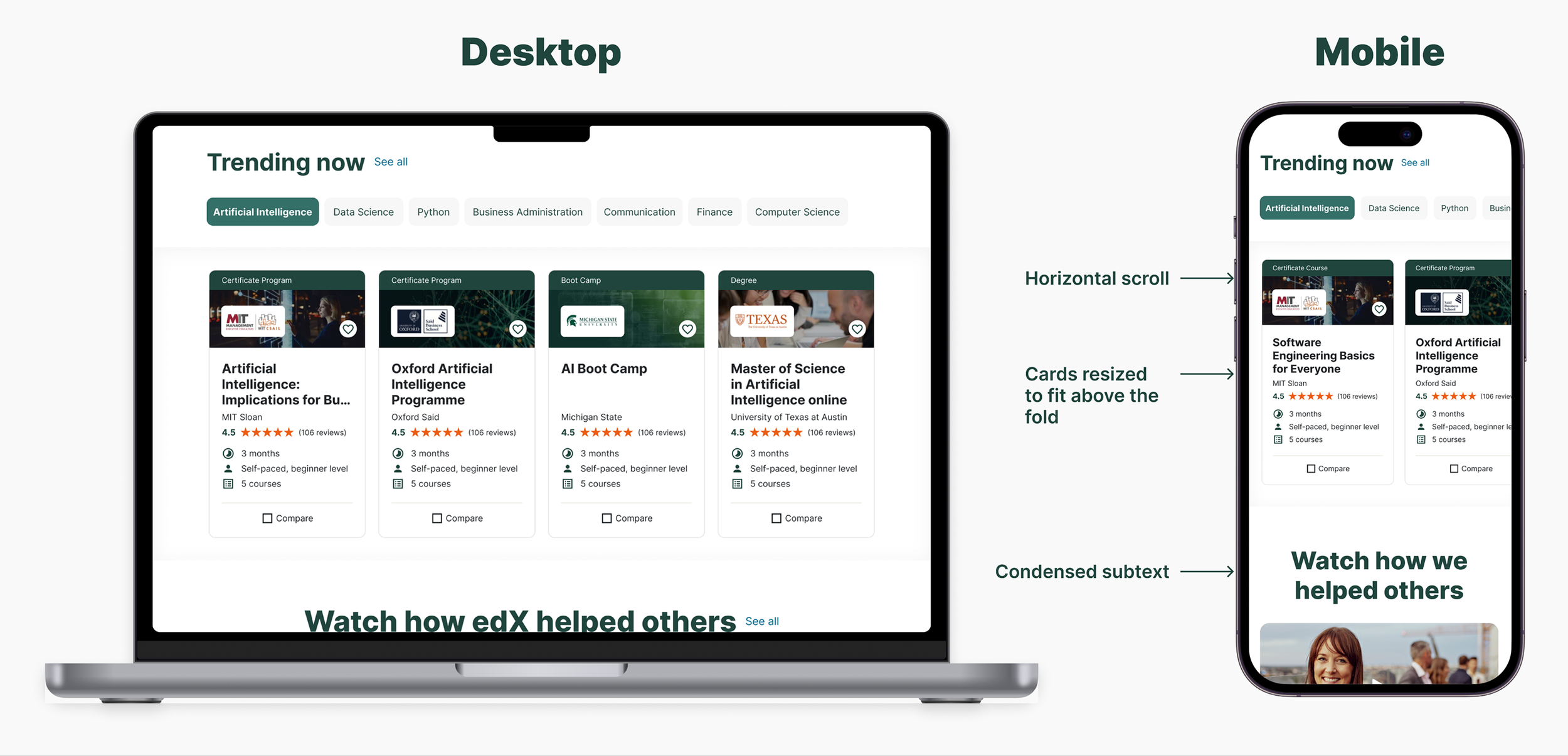
Designing for Mobile: Consistency Without Compromise
Once the desktop layout was finalized, I adapted the product card design for mobile. The goal was to maintain clarity and hierarchy while optimizing for smaller screens.
Key adjustments included:
Stacking content for better vertical flow
Prioritizing key metadata (e.g., course duration, level) towards the top
Ensuring CTA visibility without requiring scroll
Maintaining brand consistency in typography, color, and spacing
These changes helped create a mobile experience that felt familiar, functional, and just as informative as desktop without overwhelming the user.
Reflection: Designing for Clarity at Scale
While I transitioned to another team before implementation, the redesign influenced how course metadata was handled across the Marketplace.
This project pushed me to balance visual polish with dense, decision-driving content. Redesigning product cards for a platform as broad as edX meant solving not just for aesthetics, but for utility.
If I were to approach this again, I’d take a few steps differently:
Validate early with users. While research guided our priorities, we didn’t test the final designs with learners before handoff. Even lightweight testing could’ve helped us refine visual hierarchy and catch edge cases across devices.
Define success metrics upfront. We improved scannability, but lacked clear data benchmarks to evaluate impact. Collaborating more closely with Product and Data early on would’ve helped us frame outcomes beyond design delivery.
Design for extensibility. I focused on the Marketplace experience, but similar cards appear across other edX surfaces. With more time, I would’ve pushed for a shared card system to create consistency across the ecosystem.
Still, the project laid a strong foundation that’s visually clearer, more informative, and ready to scale with future iterations.