
Introduction: Automating Onboarding for Scale
As edX for Business expanded its self-service model, we faced a key challenge: how to help new enterprise admins get started without relying on manual support from Sales or Customer Success.
I led the design of an automated onboarding experience that empowers new customers to explore the platform confidently, while reducing lift for our internal teams.
Role: Design lead
Timeline: 2 months
Company: edX for Business
Focus: Scalable UX, self-service onboarding, reducing internal support load
The Problem: Manual Support Wasn’t Scalable
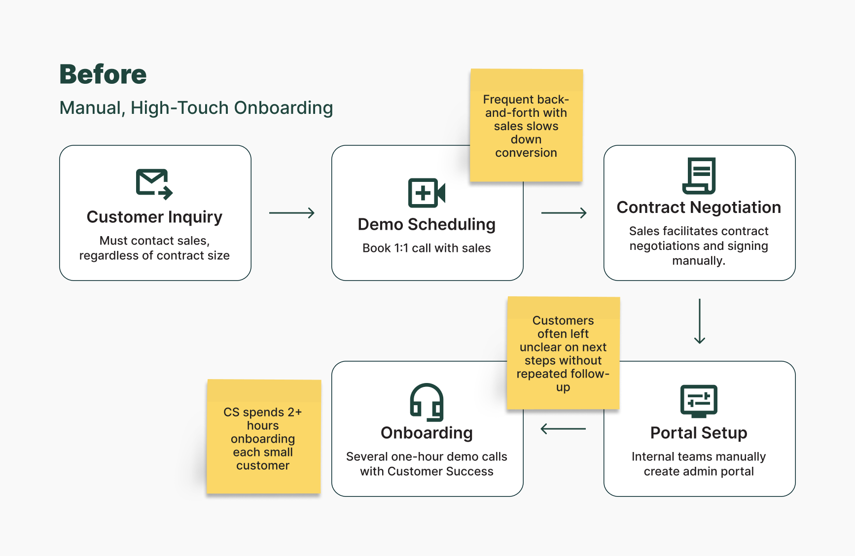
Historically, every customer — whether they spent $5K or $500K — went through the same high-touch onboarding process. This approach strained our Sales and Support teams and created a bottleneck as we scaled.
To address this, Product introduced a new threshold: contracts under $15K (which made up roughly 53% of all customers) would shift to a fully automated onboarding model. That meant more than half of our customers would need to navigate the admin portal without dedicated support.
Business pain point: Manual onboarding consumed too many resources, especially for lower-revenue accounts
User pain point: New admins still needed guidance to get started confidently
The goal was clear: design an onboarding experience that could scale, one that empowered users without relying on Sales or Support.
Getting Grounded: Understanding the Manual Onboarding Experience
To kick things off, I spoke with our Customer Success team—the folks leading multiple live demo calls for every new customer. I wanted to understand the full scope of the existing onboarding process: what steps were essential, where customers got stuck, and what a successful session looked like. By mapping out the end-to-end flow—from initial sales contact to portal setup and live training—I was able to identify friction points and opportunities for automation.
Key insights:
Onboarding calls followed a repeatable structure covering the same key features
Customers gained confidence when guided step-by-step, not left to explore on their own
A structured walkthrough outperformed static documentation in helping users succeed
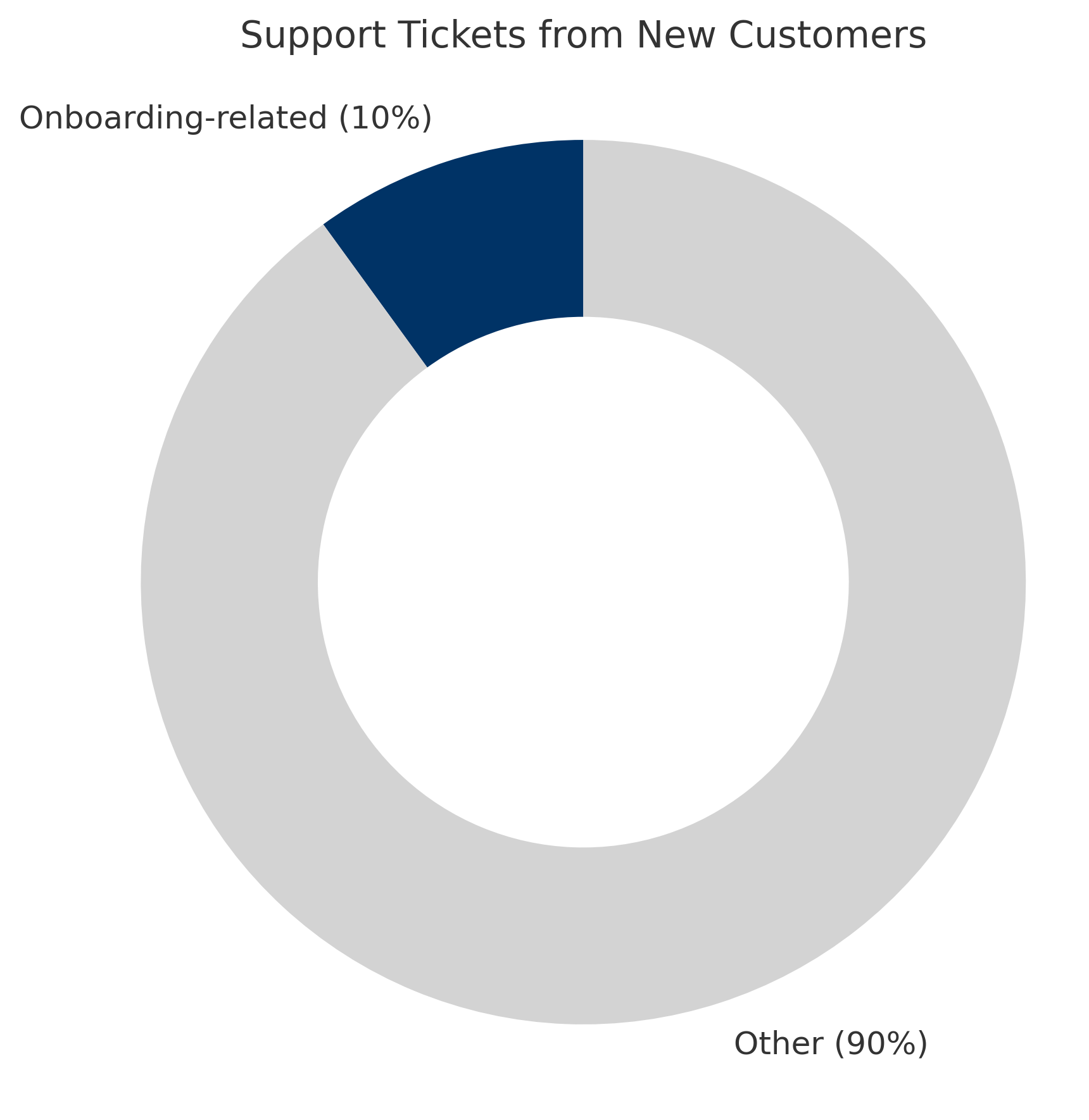
Validating the Problem with Support Data
To check if the CSRs’ approach matched real-world pain points, I audited six months of support tickets from new customers.
The results were encouraging: only ~10% of tickets were onboarding-related, suggesting that the demos were hitting the right areas. These patterns helped me define the scope for the automated experience — replicate what was already working.
Inspiration from Other Platforms
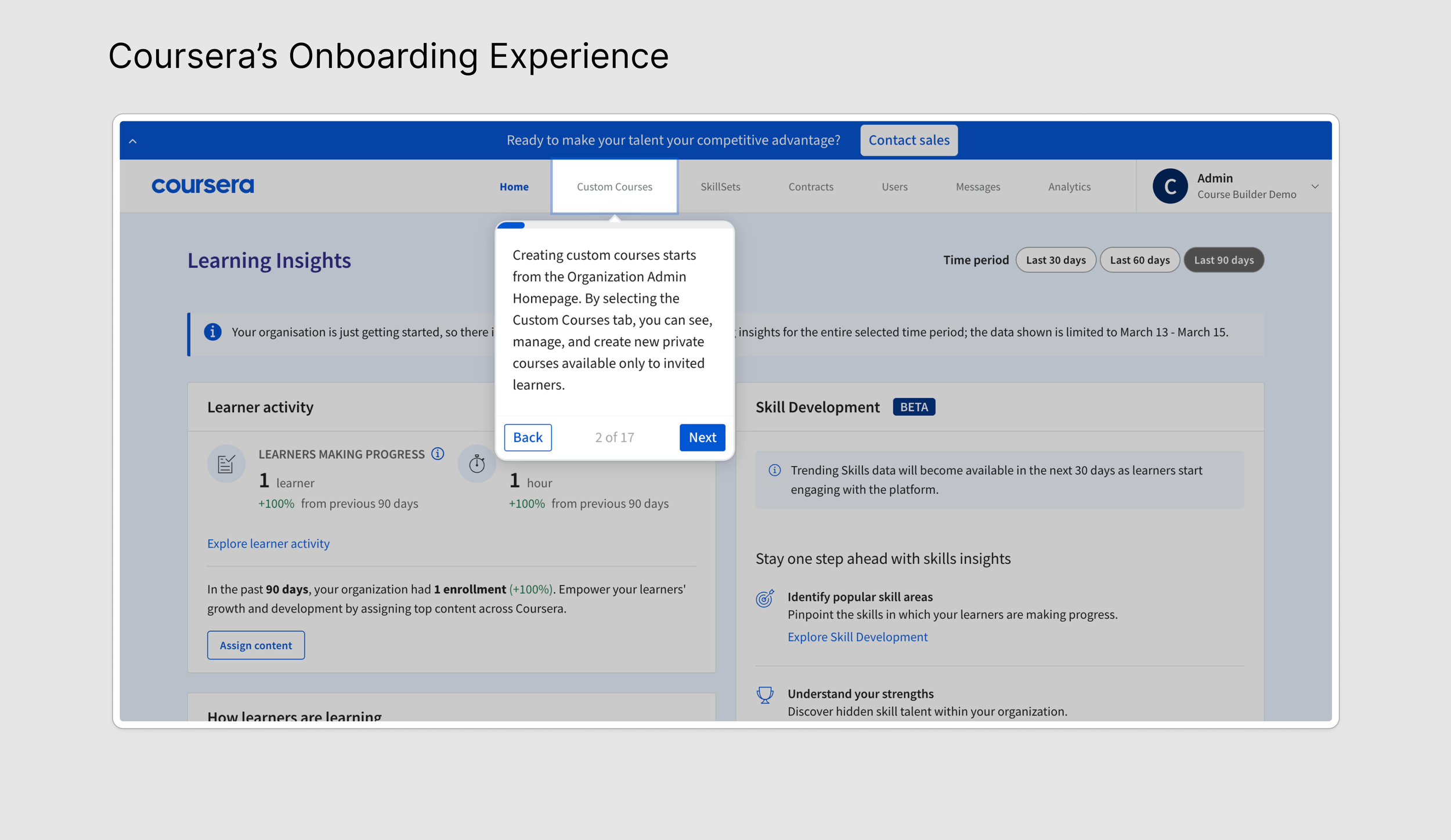
I studied onboarding patterns from platforms like Slack, Asana, Figma, and Coursera. Most used linear product tours to introduce new users to key features.
But not all of them got it right. Coursera’s long, forced tour stood out as a cautionary tale as several users told us they abandoned it before finishing. This reinforced an important principle: onboarding should guide, not gatekeep.
Iterating Toward the Right Format
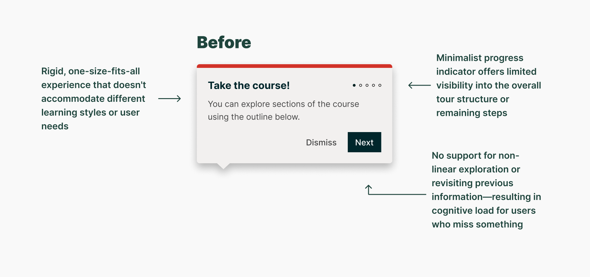
I considered reusing an existing product tour component to stay within engineering scope, but it had usability flaws. For example, a dot-based progress tracker broke down with longer flows, becoming hard to follow.
I proposed lightweight concept testing, using quick interviews with customers paired with early mockups to refine our approach.
We spoke with six users and uncovered consistent themes:
Time matters. Users didn’t want to sit through long, rigid tours
Progress dots fail. Once steps exceeded four, tracking became confusing
Users want control. Many preferred to explore at their own pace
Support needs to be accessible. Customers wanted easy access to help while navigating
These findings pointed us toward a more flexible onboarding model.
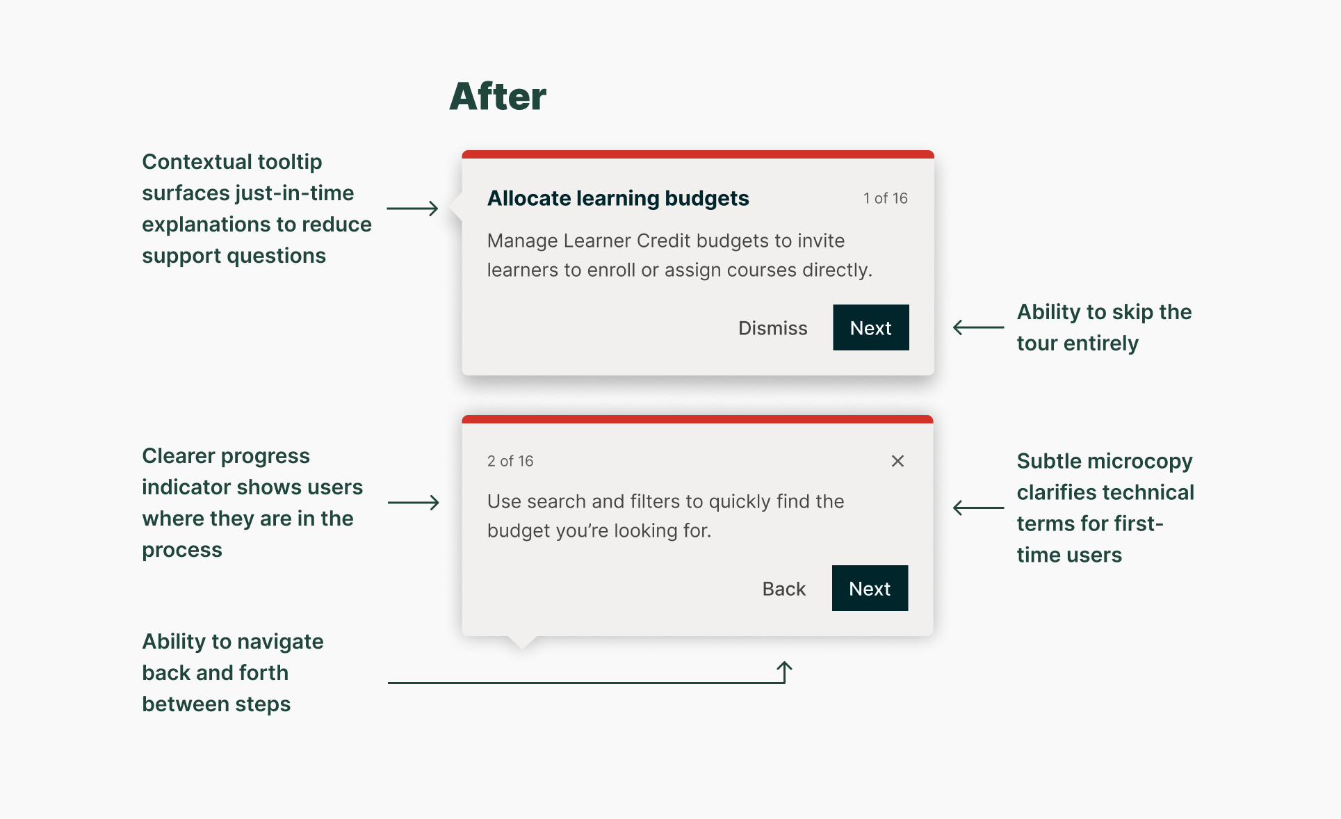
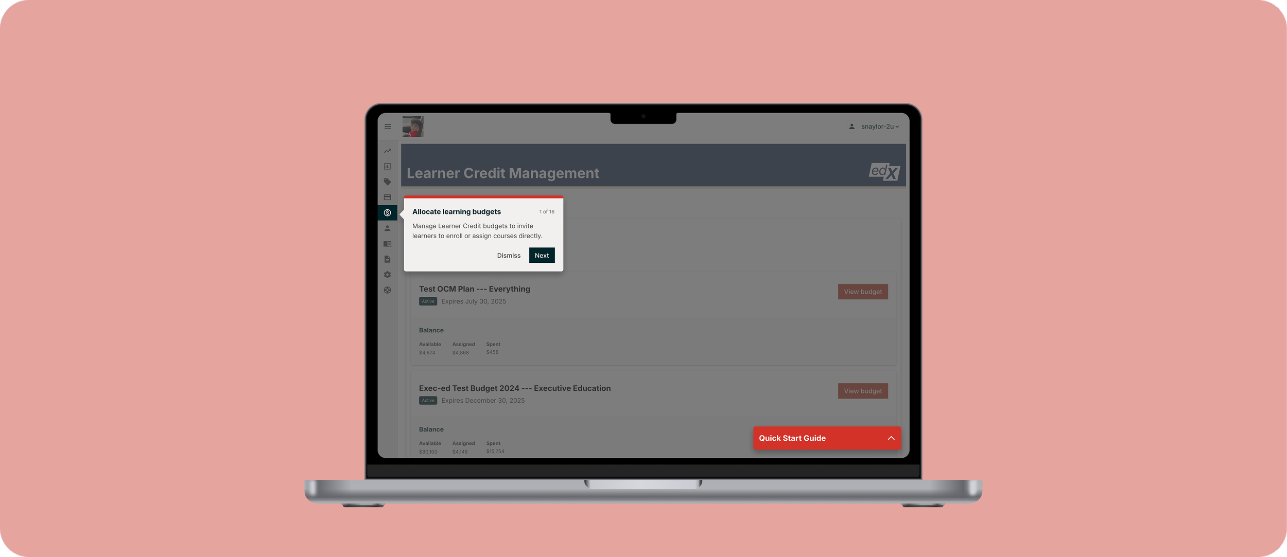
Final Design: A Checklist That Works With the User
The final solution was an interactive onboarding checklist, not a linear tour. It gave users:
The ability to complete onboarding steps in any order
A way to exit and return at any time
A clearer progress indicator using numbered steps instead of dots
We also planned for post-MVP improvements, like contextual help links and embedded support options, to make onboarding a long-term resource, not just a first-use experience.

Outcome: A Scalable Onboarding Experience That Reduces Support Load
Launched in Q1 2025, the Quick Start Guide now serves as the primary onboarding experience for all customers with contracts under $15K—a group that accounts for roughly 53% of our customer base. For higher-revenue accounts, it complements manual onboarding as a self-serve resource customers can revisit at any time.
Early impact:
Noticeable drop in support tickets from new customers
Positive feedback from both end users and internal teams
No reports of increased confusion or drop-off after launch
This validated that a well-designed, self-guided experience could successfully replace live training for more than half of our customers, freeing up internal resources without compromising user experience.
What’s Next
We’re continuing to monitor usage and support trends to inform future iterations. Next areas of focus include:
Embedding contextual support directly into each checklist step
Adding Help Center links inline to reduce friction
Capturing user feedback through optional post-onboarding surveys
Reflection
This project marked a pivotal shift in how we scale support. I designed the onboarding experience to function independently, using interviews with CSRs, support ticket analysis, and usability testing to shape a flow that helps new admins find their footing quickly and confidently.
If I were to revisit this work, I’d push for stronger alignment around measurement, establishing benchmarks for success up front. I’d also prioritize building contextual support into the first release to give users even more guidance without increasing cognitive load.